
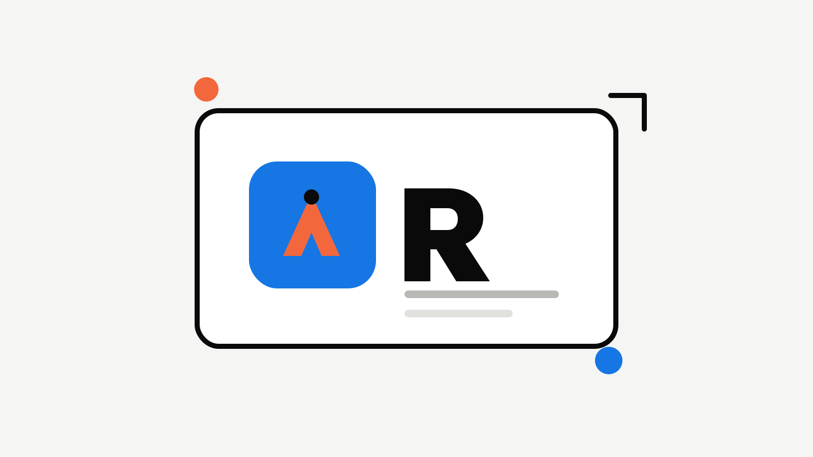
A founder can approve a logo and still have no usable app icon. The full lockup works on a landing page, then disappears in a browser tab, a social avatar, or a compact product header. The usual reaction is to shrink the whole logo until it fits. That rarely works. The logo and icon do not need to be identical. They need to be recognisably related and designed for the different amounts of space they receive.
Give the full logo and the icon different jobs
Your full logo is for places where people have enough room to read a name: a website header, launch graphic, deck cover, or email footer. It can combine a wordmark with a mark, and it can carry a little more personality. Your icon is for small, repeated touchpoints: the browser tab, a social avatar, a product shortcut, or the corner of a navigation bar. At that size, a name is often unnecessary. The icon should be the strongest memorable shape from the wider identity. Trying to make one file cover both jobs leads to an icon full of illegible letters or a page header that feels anonymous. Treat them as a pair, not as a scaled copy.
Start with a simple visual anchor
Pick the part of the logo that survives when details disappear. It might be:
- A distinctive initial or monogram.
- A geometric shape with an unusual cut or overlap.
- A simplified symbol from the full mark.
- A small colour relationship that is unique to the brand. The test is simple: can someone recognise it after seeing it beside the full logo a few times? It does not need to tell the entire company story by itself. It needs to be clear and repeatable.
Design for the smallest real use
Do not judge an icon only on a large artboard. Reduce it early and look for details that turn to noise: thin lines, tiny gaps, multiple words, and subtle gradients. At a small size, favour a confident silhouette, strong contrast, and clear spacing around the mark. If an element is not carrying recognition, remove it. The goal is not to preserve every part of the logo; it is to preserve the part people remember. Try the icon against both light and dark surfaces. A mark can look excellent on its original background yet lose contrast when a browser, operating system, or social platform places it somewhere else.
Keep the family resemblance visible
The most useful connections between a logo and icon are usually modest:
- Use the same primary colour or a closely related palette.
- Repeat the logo’s most distinctive angle, curve, or shape.
- Keep the visual tone aligned: technical, playful, editorial, or restrained.
- Use similar corner treatment and contrast. Avoid adding a separate mascot, a new typeface, or a different colour story just to make the icon interesting. The compact version should make the full logo feel more familiar, not introduce a second identity.
Export and label the pair clearly
Once the pair works, save the approved versions together. Include the full logo for light and dark backgrounds, the icon for light and dark backgrounds, and transparent versions for use across product and marketing work. Use names that explain the intended use. “Primary logo,” “dark logo,” “app icon,” and “social avatar” are far more helpful than a folder of files called “final.” A collaborator should not have to guess whether the square mark is current or whether a dark version is intended for a profile image. Rocket supports this practical workflow: refine a logo direction, create a related icon, test the pair in the places a customer will see it, and keep the approved exports with the rest of the Brand Kit. That makes the smallest version of a young brand feel just as deliberate as the largest.

Founder of Rocket. Previously built and branded a handful of products the hard way — hand-drawn logos, mismatched fonts, brand kits that never shipped. Now writing about how founders can build brands people remember.
All articles by Alex →