
Typography is easy to underestimate when you are launching a product. A founder may choose a display font for a logo, then use whatever happens to be available everywhere else. The result can look polished in one hero section and unrelated in the product UI, social graphics, and pitch deck. You do not need an elaborate type library at this stage. You need a compact system that makes the product easy to read and gives repeated communications a familiar rhythm.
Start with two clear jobs
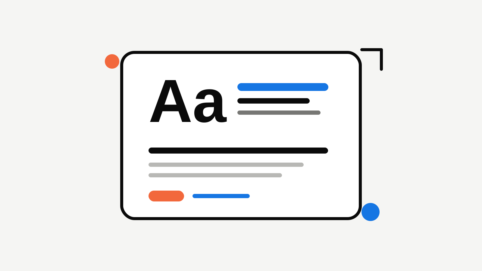
Most early products need two type roles:
- Display type for short headlines, a product name, launch graphics, and occasional emphasis.
- Body type for paragraphs, labels, navigation, product copy, and anything a customer has to read quickly. The display choice can carry some personality. The body choice should be calm and dependable. If both are highly decorative, the design gets tiring. If both are entirely neutral, the brand may lose its voice. The balance comes from giving each one a job.
Choose readability before novelty
The body type will appear far more often than the headline font. Test it in a product card, settings form, pricing table, and paragraph before you decide it is right. Look for clear letterforms, comfortable spacing, and a range of weights that can create hierarchy without forcing you to add a new font. For a display treatment, test a short outcome-led headline rather than the company name alone. A font can look great for six characters and struggle when it has to carry a real product message.
Define a small hierarchy
Write down a simple hierarchy before creating launch assets:
- One headline treatment for the page or card's main idea.
- One subheading treatment for context.
- One body treatment for explanatory copy.
- One small label treatment for tags, buttons, and product metadata. You do not need unique sizes for every section. Repeating a few clear levels makes a young product feel more intentional than a collection of one-off text styles.
Test the system where customers will see it
Apply the choices to four common surfaces: a website hero, a product screen, a social card, and a compact launch graphic. Each surface asks something different of type. A giant landing-page heading can survive more personality than a small button label; an editorial social card can use more contrast than a settings panel. The system is working when those surfaces still feel related without looking mechanically identical. If a social graphic requires a third unrelated font to feel interesting, simplify the graphic before expanding the type palette.
Keep the font rules with the rest of the brand
Record the approved display and body choices, their intended roles, and a few examples of each. This makes the next landing page, launch card, or freelance handoff faster because no one has to guess which style is current. Rocket lets you keep typography alongside the logo, colour system, and Brand Guidelines. That turns a font choice from a one-time visual preference into a practical rule the rest of the product and launch work can reuse.

Founder of Rocket. Previously built and branded a handful of products the hard way — hand-drawn logos, mismatched fonts, brand kits that never shipped. Now writing about how founders can build brands people remember.
All articles by Alex →