
For many early products, a social profile is one of the first places a potential customer checks after seeing a launch post, recommendation, or founder comment. It is also easy to leave half-finished: an old logo as the avatar, a generic banner, and a bio that says less than the product website. You do not need a content calendar or a full social team to fix that. You need a small, repeatable profile system that makes the company easier to recognise and easier to understand.
Treat the profile as a compact landing page
A visitor should be able to answer three questions in a few seconds:
- What is this product?
- Who is it for?
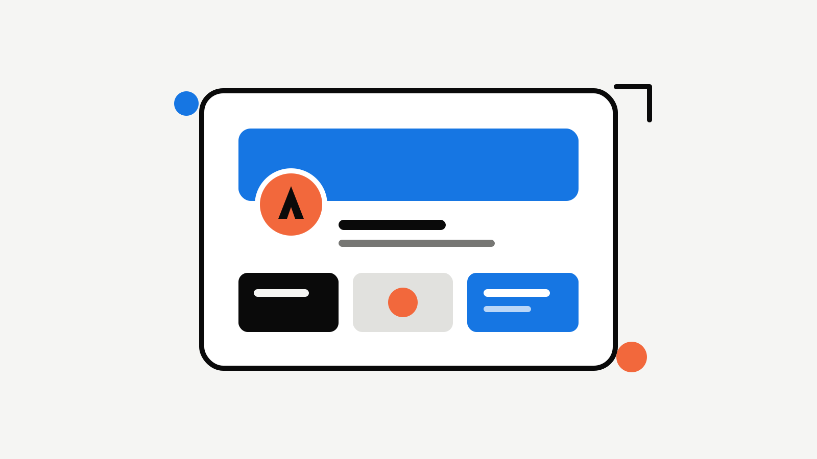
- Where should I go next? Write the bio around the outcome rather than the internal category. “Turn product ideas into launch-ready brand assets” is more useful than “AI creative platform.” Then add one clear destination: the product site, a waitlist, a demo, or the current launch page. The bio does not have to explain everything. Its job is to give the avatar, banner, and recent posts enough context to make sense.
Use the icon where people expect an icon
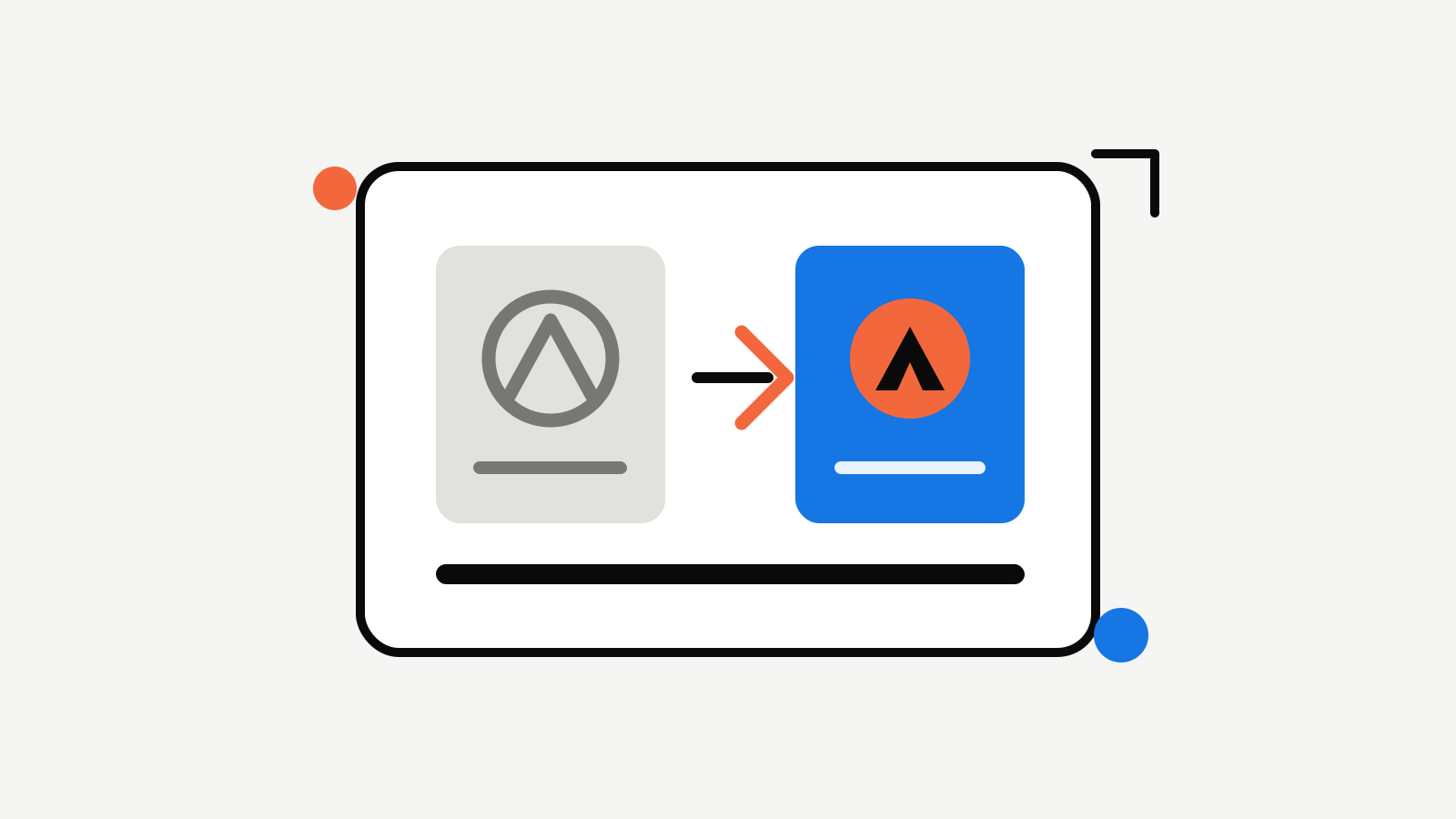
Social avatars are tiny and often sit beside other brands in a crowded feed. Use the compact icon or mark, not a squeezed wordmark. It should have the same primary colour, silhouette, and visual tone as the logo people see on the website. Test the avatar at its displayed size. If it only works as a large exported square, simplify it. Thin details, small lettering, and subtle background treatments tend to disappear precisely where a profile needs to be recognised.
Give the banner one job
A banner is not a second homepage. Pick one message that reinforces the profile:
- The product’s clearest outcome.
- A concise launch announcement.
- A memorable positioning line.
- A product view that makes the category obvious. Use the approved palette, type treatment, and enough empty space that the message remains readable when an avatar overlaps part of the image. Do not put six features, three calls to action, and every logo variation into the same strip.
Build one repeatable post frame
Social graphics become inconsistent when every post starts from a blank canvas. Create a light framework instead: a background treatment, a headline style, a logo placement, and one or two accent elements. Then let the content change inside it. That is enough to make a founder update, product screenshot, customer quote, or launch announcement feel related. The post does not need to look identical each time. It just needs to carry the same visual cues.
Keep profile assets with the rest of the kit
Save the approved avatar, banner, and post treatment next to the logo, colours, and typography. This prevents a surprisingly common problem: social profiles keep using a version of the brand that the website replaced weeks ago. When something changes, update the source kit first. That makes it easier to refresh the profile, hand the work to a freelancer, or make a launch graphic without recreating the visual decisions. Rocket can keep those pieces in the same workflow: refine the logo and icon, create supporting social assets from the approved brand direction, and store them with the rest of the Brand Kit. The goal is not to make every social profile elaborate. It is to make every first impression feel like the product people are about to visit.

Founder of Rocket. Previously built and branded a handful of products the hard way — hand-drawn logos, mismatched fonts, brand kits that never shipped. Now writing about how founders can build brands people remember.
All articles by Alex →